Overview
Shape is a swipe-based professional networking app that helps specialists connect intentionally, especially during conferences and industry events.
The app removes the awkwardness and randomness of offline networking by enabling structured, interest-based matching before people even start a conversation.

The Problem
Conferences are designed for networking — yet in reality, people rarely know who is actually relevant for them to meet. Approaching strangers often feels awkward, high-pressure, and inefficient.
Even when surrounded by hundreds of professionals, meaningful connections rarely happen organically. Most interactions start with small talk and surface-level introductions, consuming time without guaranteeing value.
The Goal
The goal of this project was to simplify and improve professional networking at conferences by making connections more intentional and informed.
The app enables professionals to:
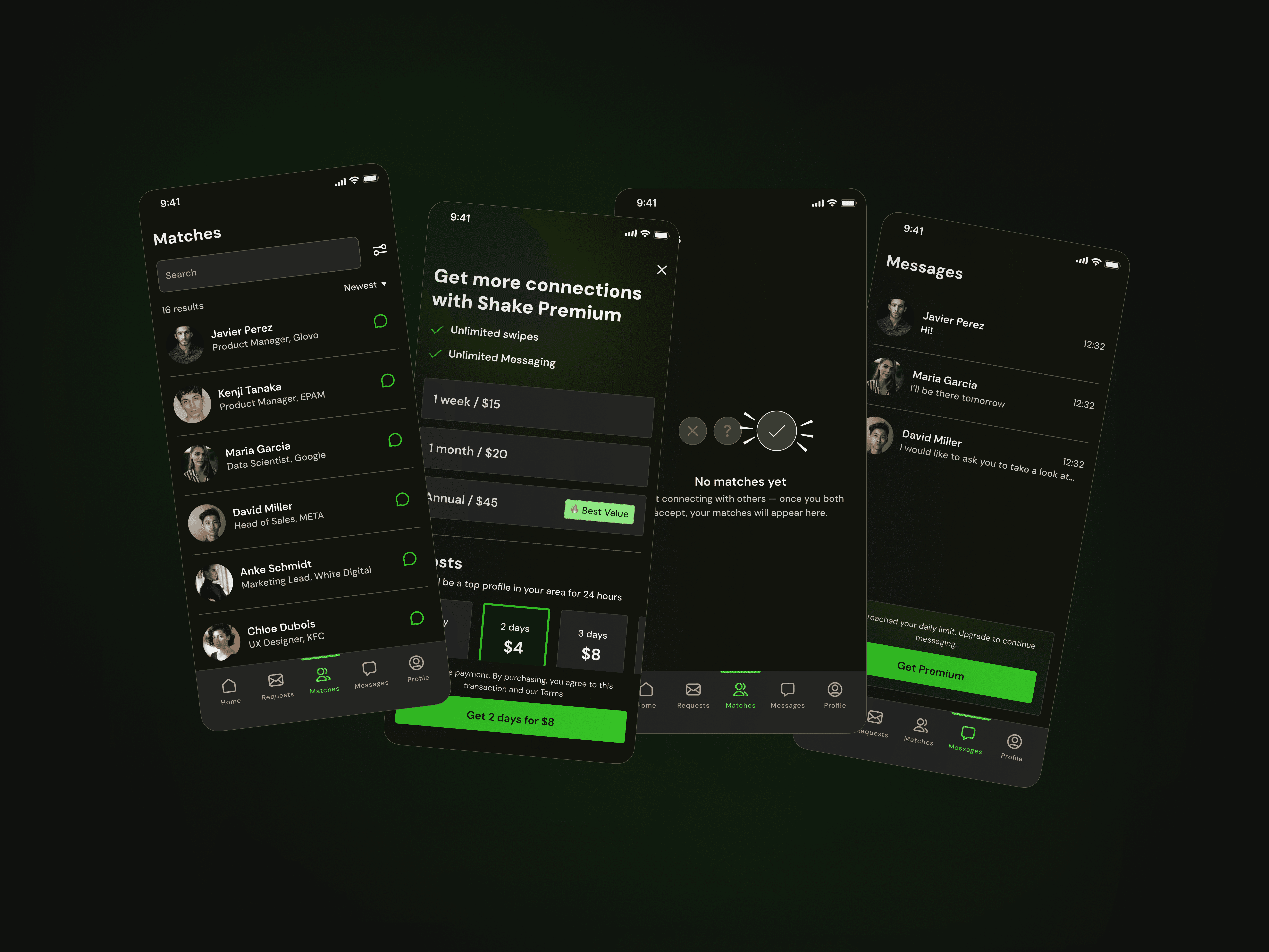
Instantly see a person’s career and experience, eliminating the need to spend valuable time on introductory small talk.
Understand someone’s communication style, allowing users to decide whether they want to engage — and how best to approach that person.
See all professionals nearby, regardless of where they are at the conference venue.
The focus was to reduce friction, increase confidence, and make networking feel natural rather than forced.
Process
1. Competitive Research
I started with competitor analysis. Interestingly, most relevant patterns came from dating apps rather than professional networking platforms.
Despite serving a different purpose, these apps offered valuable interaction patterns. For example, Happn shows a user’s city of residence as well as the city they are currently visiting. This feature is particularly useful for professionals who frequently travel for business trips and conferences, and it became an inspiration for our solution.
The research phase helped identify transferable UX patterns while adapting them to a professional context.
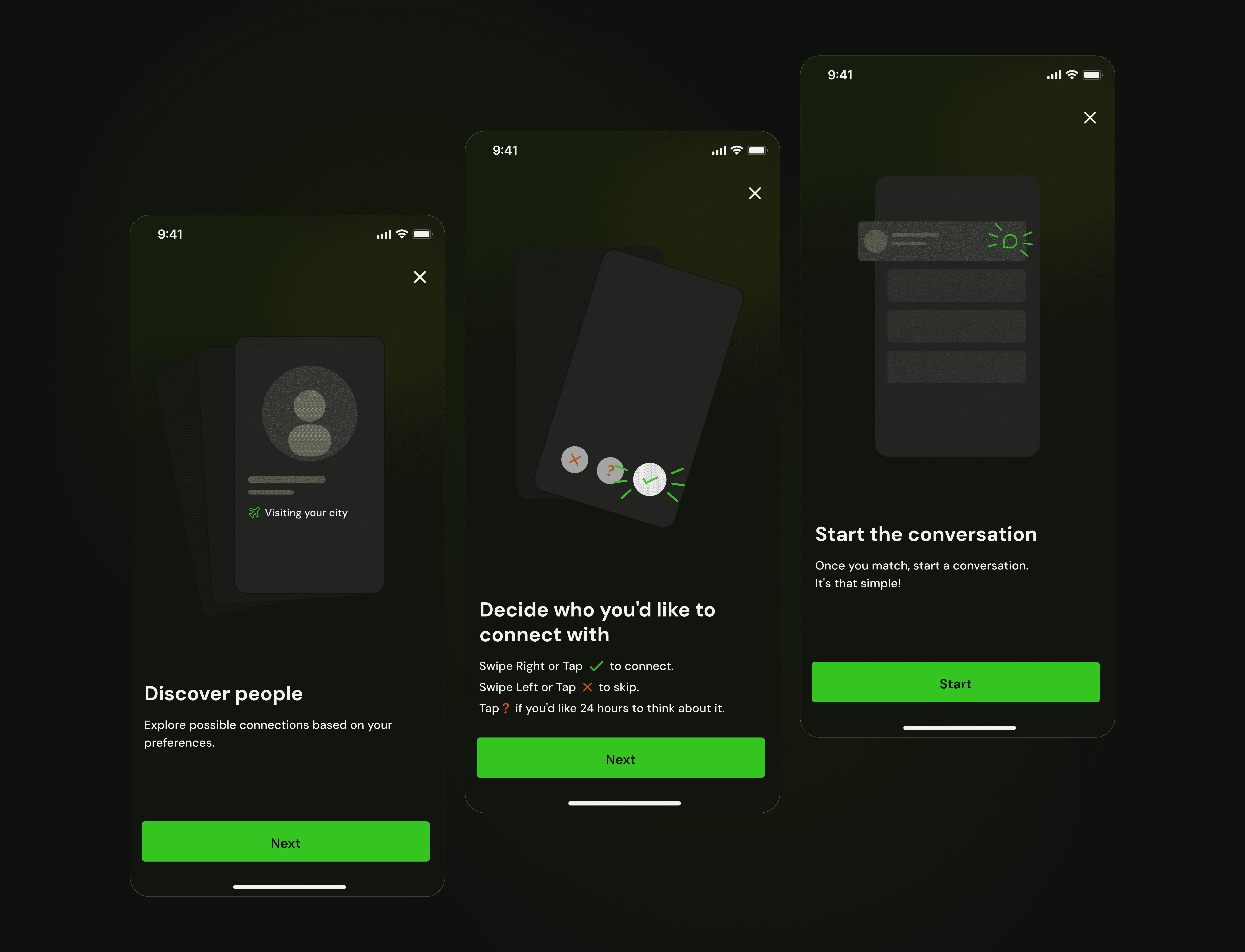
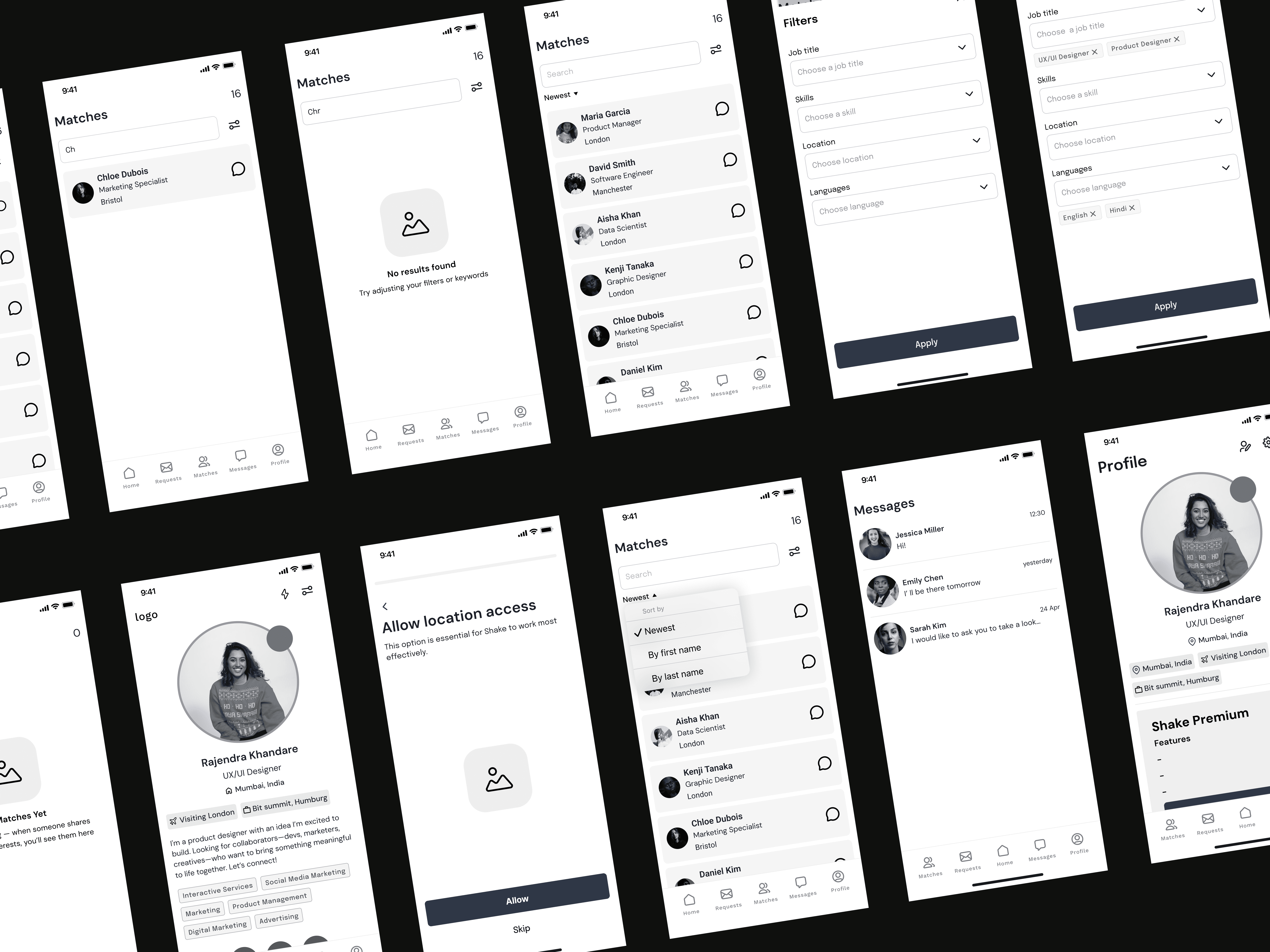
2. Wireframing
Next, we moved into the wireframing stage, defining the app’s structure and user flows.
At this stage, we focused on:
Profile hierarchy
Nearby professionals view
Interaction mechanics
Key networking actions
The goal was to establish a clear and intuitive foundation before moving into visual exploration.
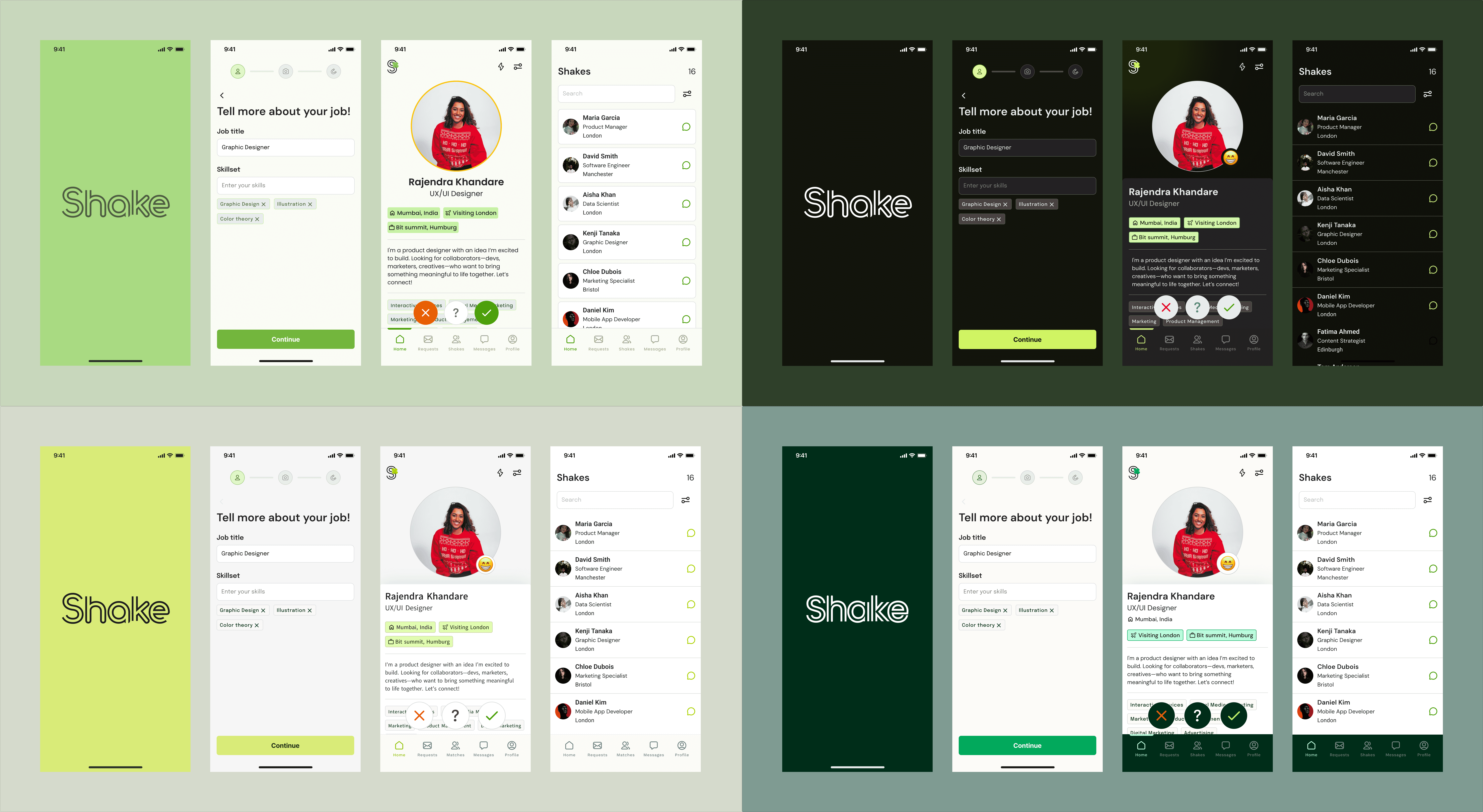
3. Concept Development
During the concept phase, I prepared several visual directions for the client to choose from.
After gathering feedback, we refined the selected direction and moved into high-fidelity mockups.
Key Challenge
One of the biggest challenges in the project was defining how to display a user’s communication style.
Initial Proposal
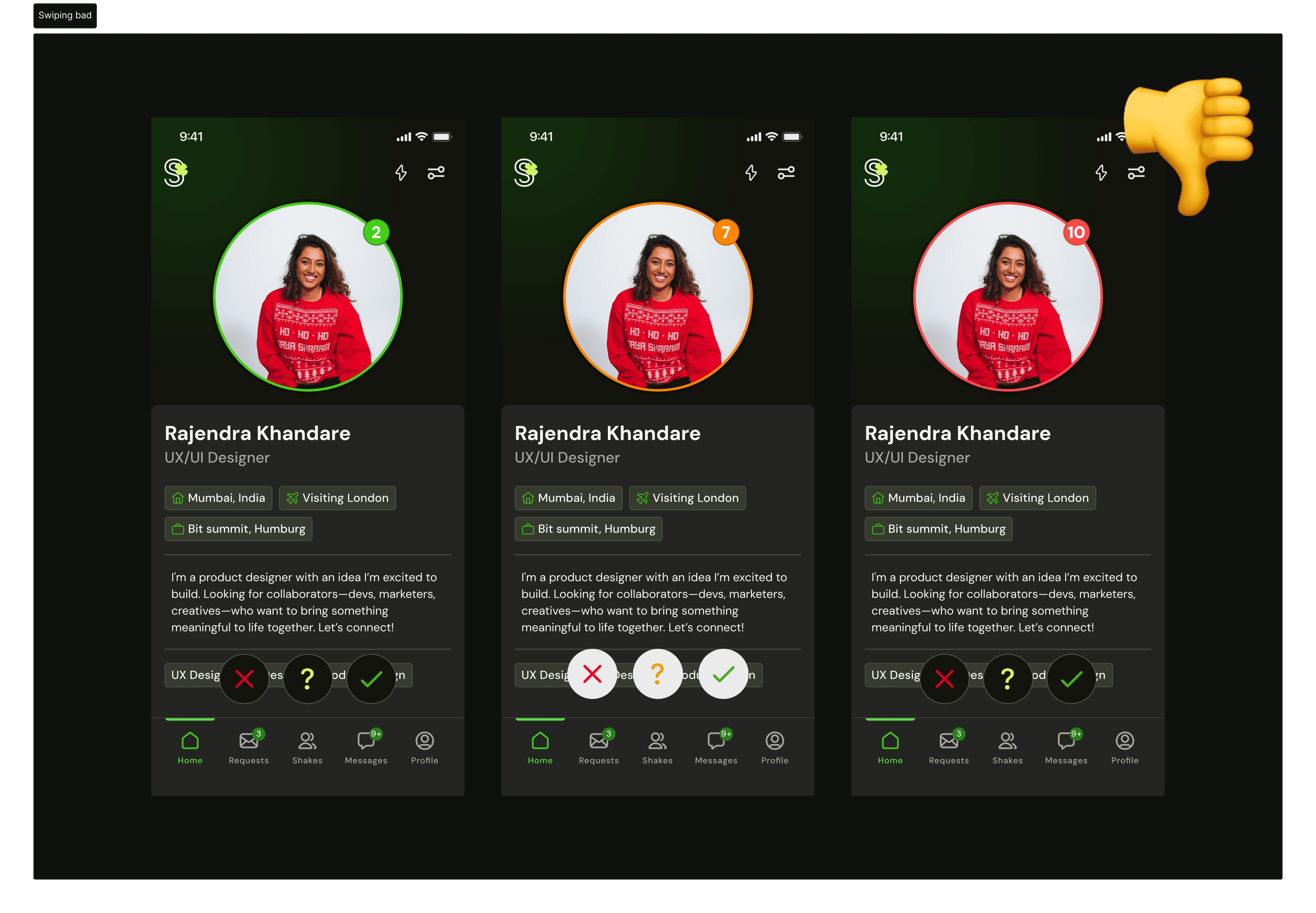
The client initially suggested using colored borders around profile cards:
Green — highly outgoing
Yellow — moderately outgoing
Red — not very outgoing
However, this approach did not meet accessibility standards, since color would act as the only indicator. Users with color vision deficiencies could struggle to interpret the information correctly.
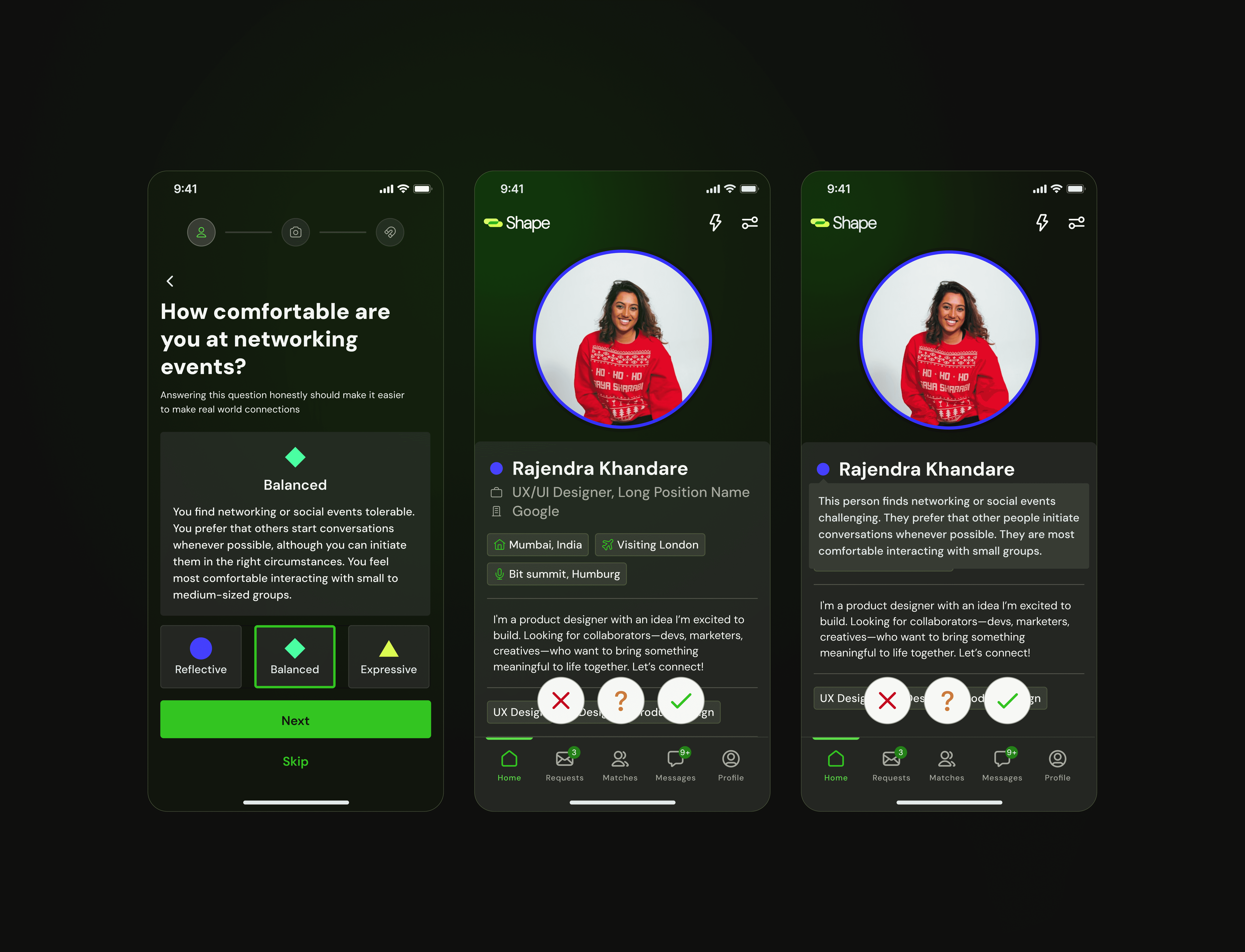
Second Iteration
After discussion, the client's solution evolved into a 1–12 scale, still using the same color coding.
However, I identified several issues with this approach:
Too many options — a 12-point scale adds unnecessary complexity and could overwhelm users.
Emotional discomfort — even if someone is introverted, selecting a low “outgoing” score (e.g., 2 out of 12) may feel self-deprecating. It unintentionally communicates something like “Don’t talk to me”, which can discourage meaningful interactions and negatively frame the user’s personality.
Networking tools should empower users — not label them in a limiting way.
Final Solution
After further brainstorming and discussion, I proposed a refined solution:
Three clearly defined communication profiles, simplifying decision-making.
Each profile has a distinct name and description, helping users identify themselves without judgment.
Profiles are represented through distinct shapes/icons, ensuring that color is not the sole indicator (addressing accessibility concerns).
Each communication style badge is clickable, allowing users to see a detailed explanation of what it means.
This approach balanced clarity, accessibility, emotional comfort, and usability — while maintaining personality within the product.
Outcome
The final solution:
Reduced social friction at conferences
Helped users approach networking with confidence
Made professional compatibility visible before initiating contact
Ensured accessibility and thoughtful UX decisions
By shifting networking from random encounters to intentional discovery, the app transforms conferences into spaces where meaningful professional connections happen naturally.