Overview
Finform is a data collection platform designed for the financial industry. The application enables accountants to gather financial data and collaborate with their clients, ensuring transparency and security.
The business goal of Finform is to simplify and optimize the financial data collection process by providing a collaborative platform that reduces manual effort and enhances clarity.
During the design process, my focus was on creating an intuitive user interface that:
Minimizes the time accountants and clients spend on data collection.
Ensures a seamless and secure collaboration experience.

Research & Analysis
The first step was to get familiar with the documentation. I analyzed all the information provided to understand the platform's purpose, user needs, and technical constraints.
Brainstorming Solutions
To visualize potential solutions, I began with a quick brainstorming session using sketches. This approach allowed me to:
Quickly generate a variety of ideas.
Evaluate and select the best concepts for further development.
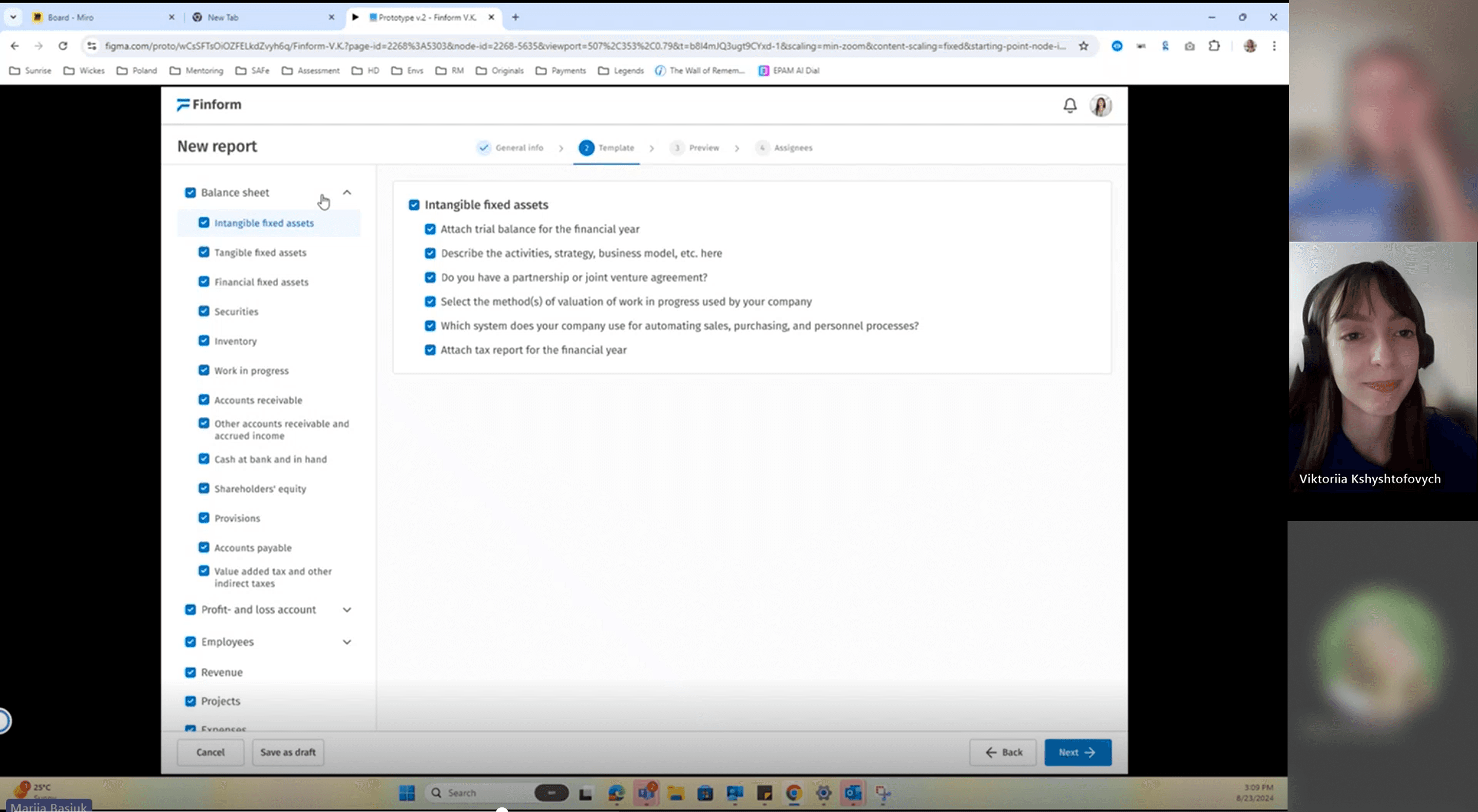
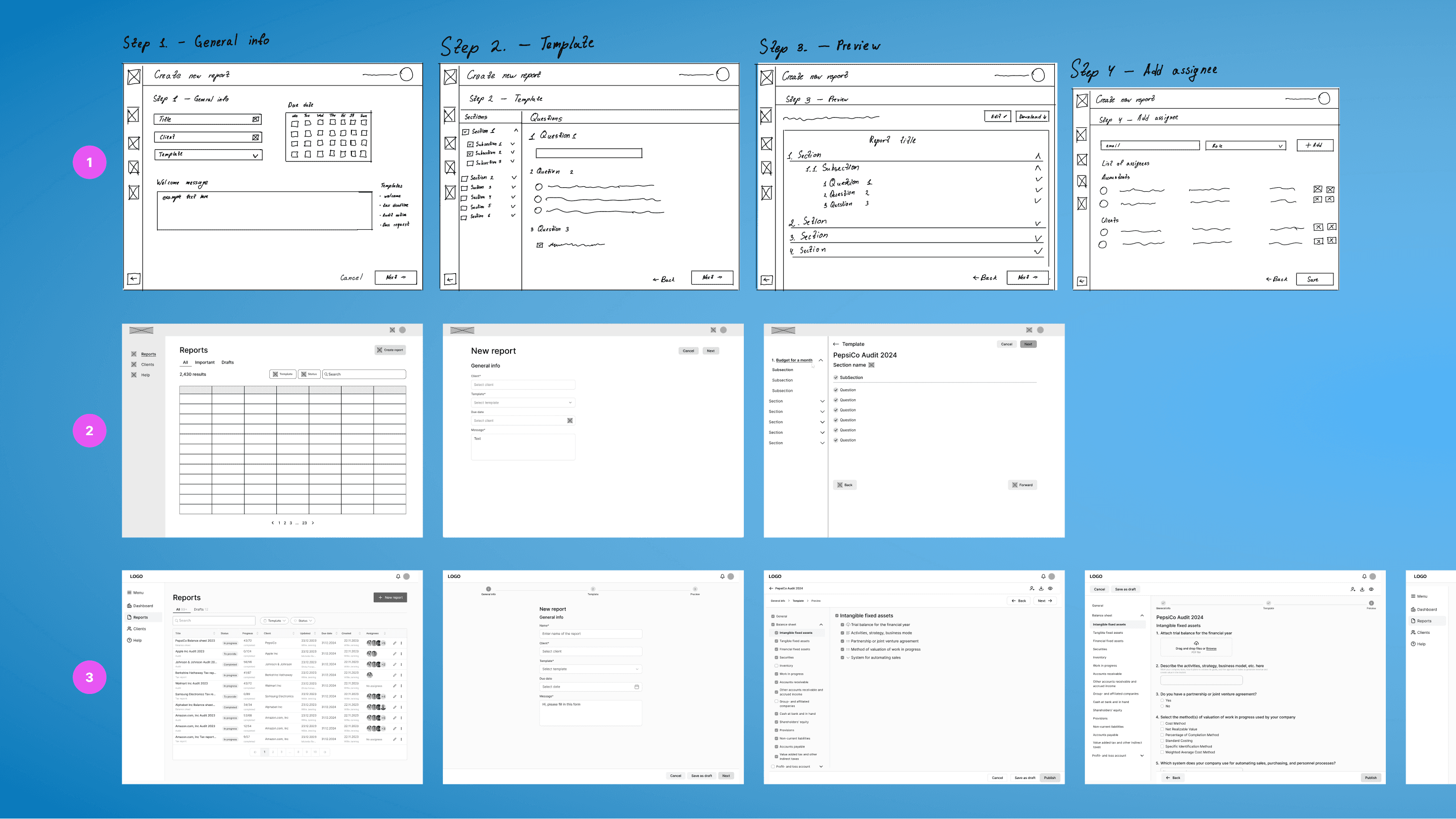
Wireframing
During this stage, a significant challenge was designing an intuitive workflow for accountants to create reports. I focused on carefully crafting the structure, flow, and visual hierarchy within the wireframes. This ensured that the foundation was set for a smooth transition into the visual design phase.
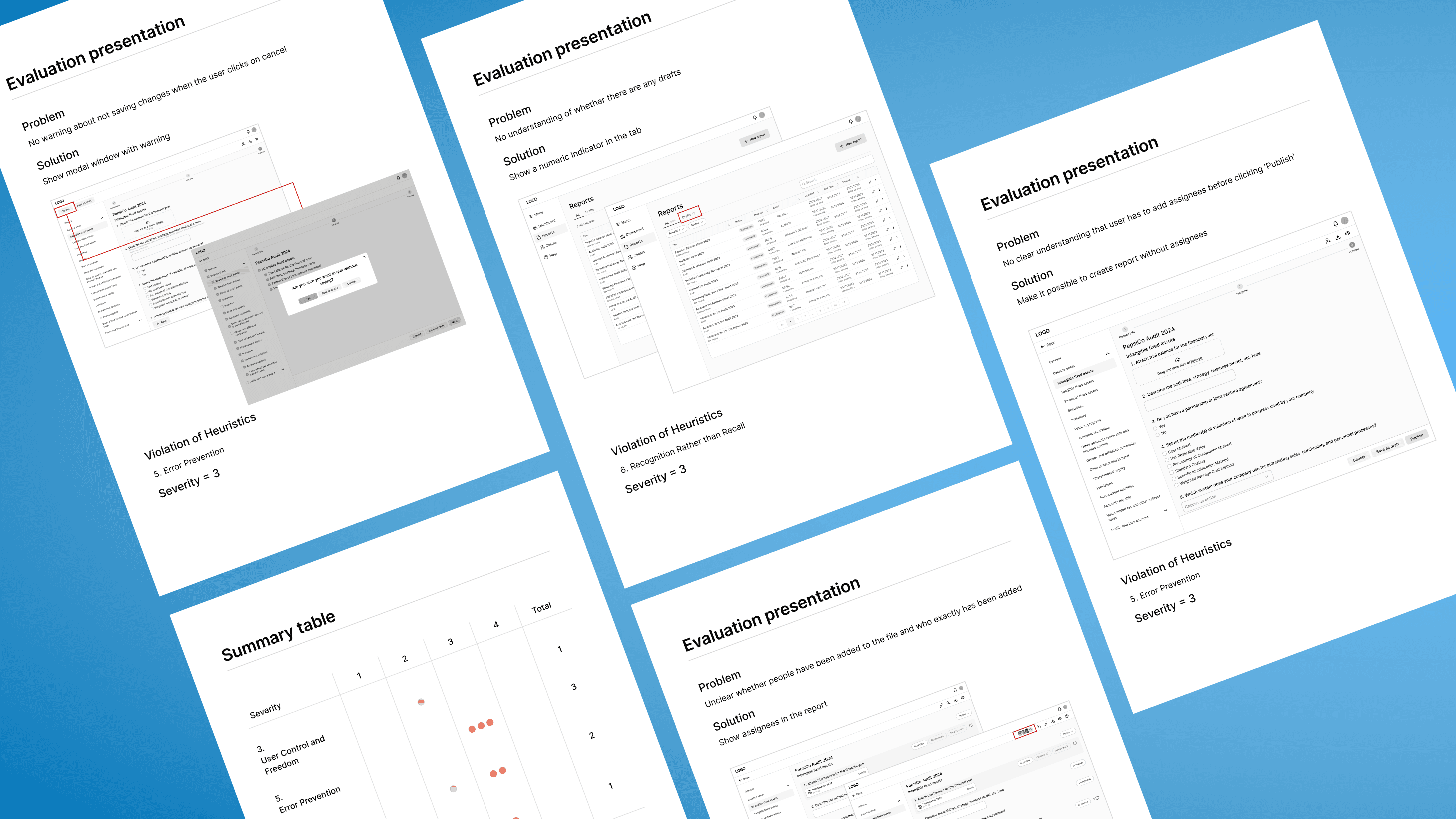
Heuristic Analysis
To identify gaps and refine my solutions, I conducted a heuristic analysis. This process not only helped me fix existing issues but also inspired new features to enhance the user experience. These additional features aimed to make the platform even more user-friendly and efficient.
Concept Development
The next step was to establish the overall design style that would define the application. At this stage, I focused on:
Color proportions to create a visually balanced interface.
Element corners to set the tone for a modern and approachable design.
Typography for readability and usability.
For the typography, I chose Fira Sans because it matched the desired tone of the application. More importantly, it offered excellent readability, especially in table layouts. Its compactness allowed for more content to fit within table cells without compromising clarity.
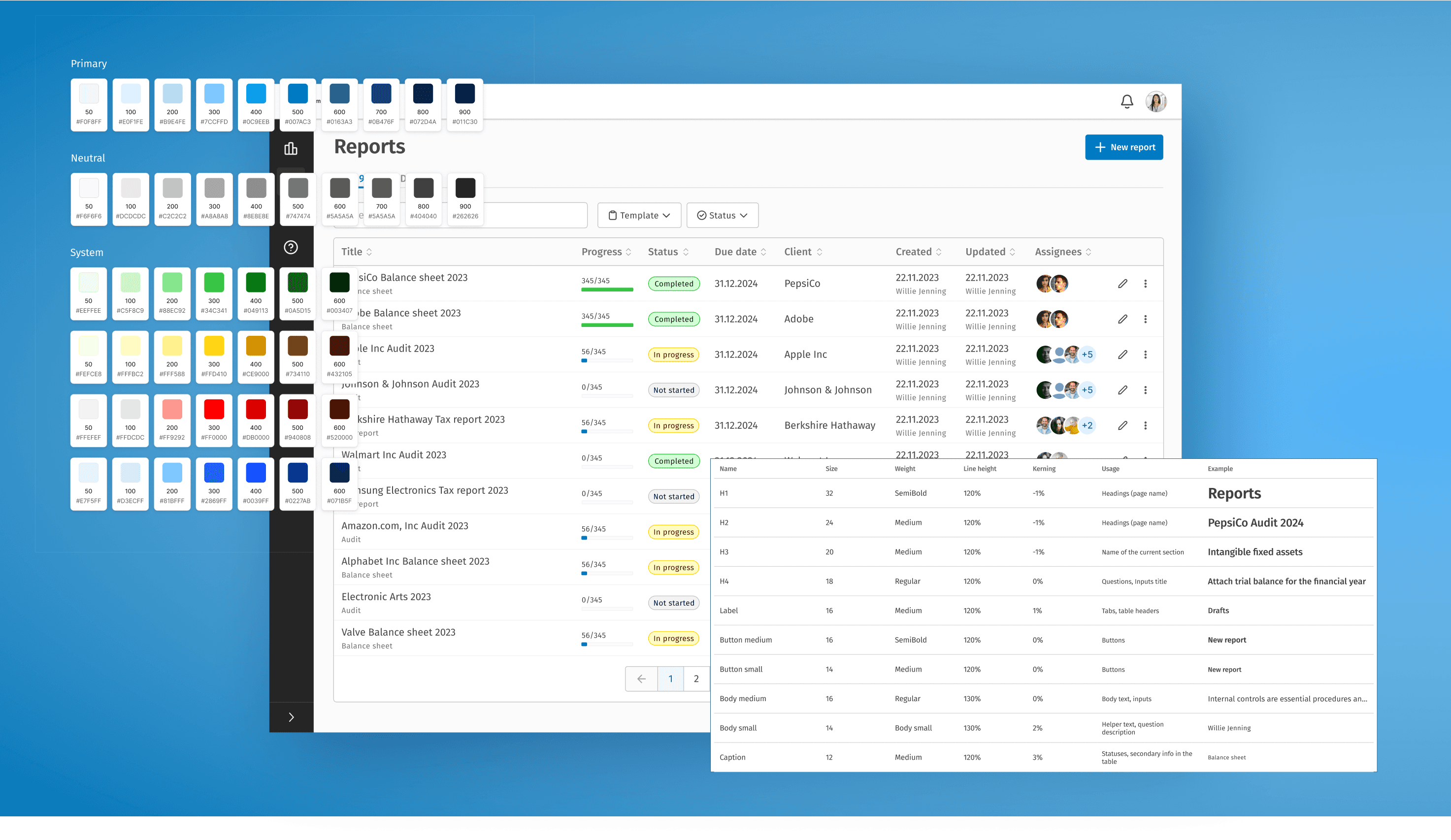
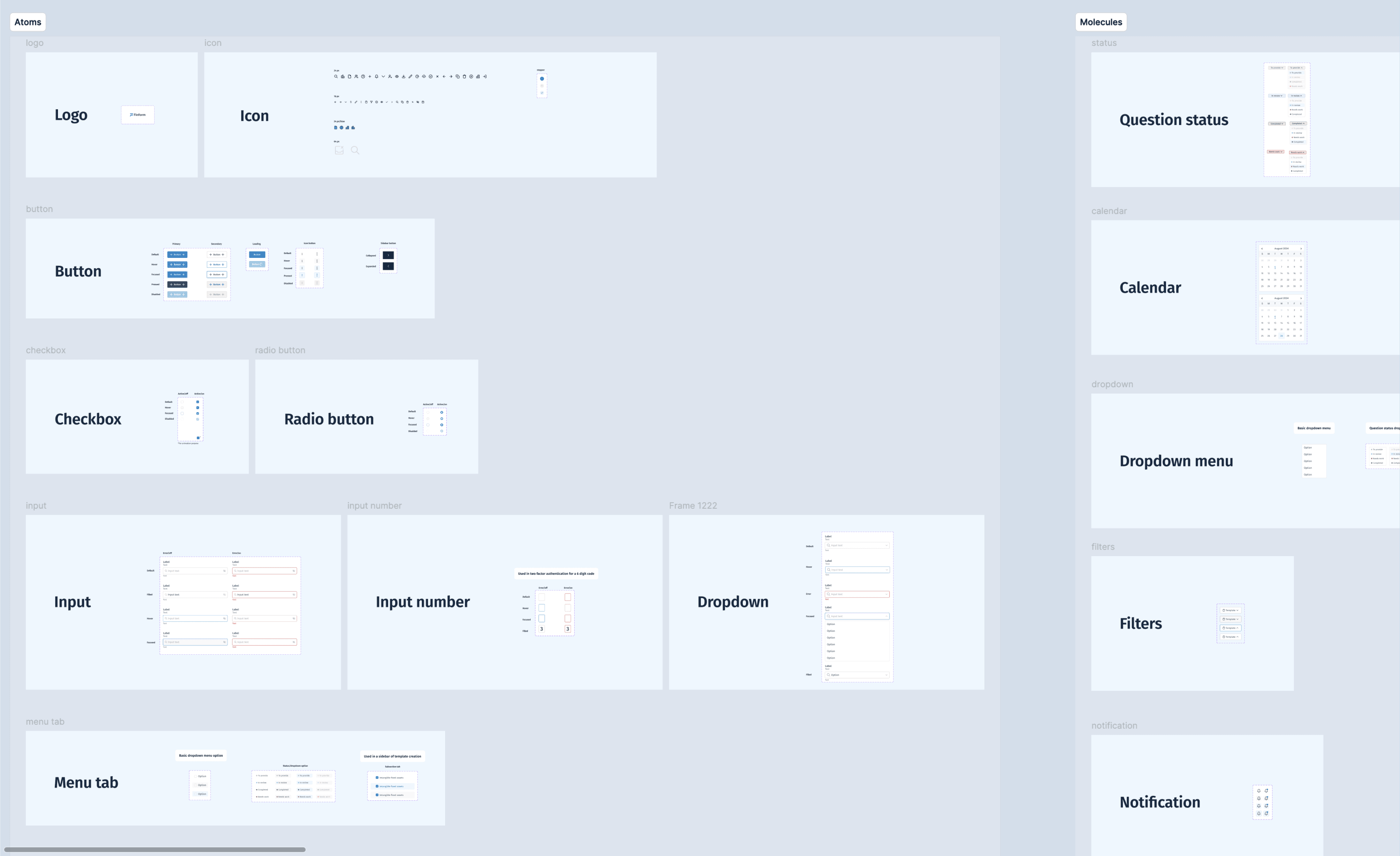
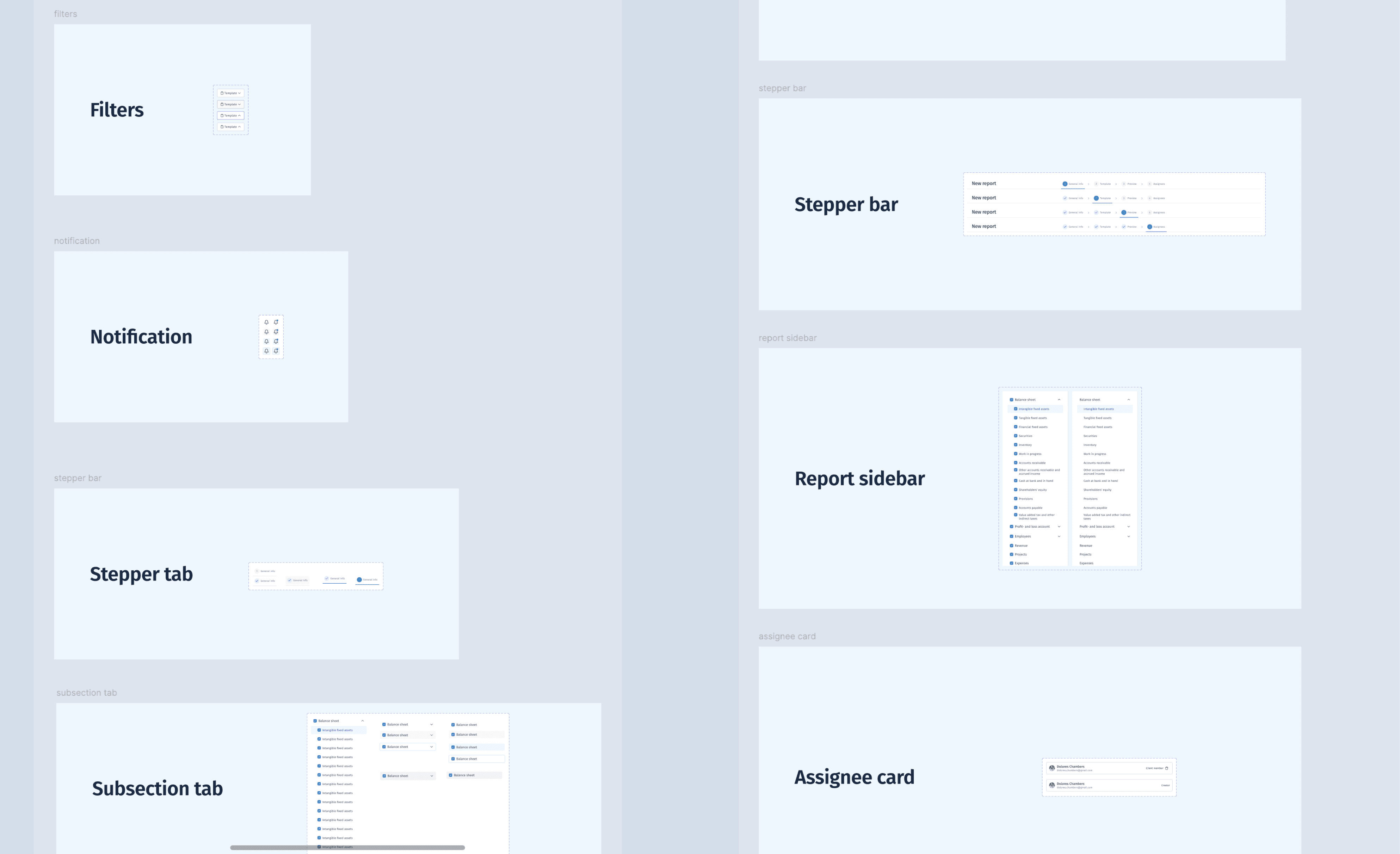
Design System
To maintain consistency and organisation throughout the project, I developed a design system using the atomic design methodology. The system included:
Component specifications.
Detailed guidelines for usage.
Variable creation, which I practiced during this project to enhance scalability and flexibility.
Final Phase: User Testing
The final phase of the project involved testing with one user. For this, prepared hypothesis, wrote a script and tasks and conducted our session.
Although a single user test is insufficient for drawing comprehensive conclusions, it provided valuable experience in conducting usability testing and interacting with users.